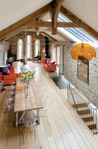
this used to be a barn. A BARN. the design scheme here isn't necessarily my favorite {just look at that orange lamp in the foreground- quite ugly}, but i am just stunned by the fact that this used to be a barn, but was turned into something very liveable and pretty.
i love love love high ceilings, and exposed wood beams always make me happy. i love seeing some rawness in design, and signs of real life. instead of looking like everything was covered up or painted over, the natural beauty shines through.
the stone walls are okayyy, but i honestly think i would have gone with something else. i'm just not sure i like it. maybe it's just this particular style of stone: to me, it just doesn't seem to match well.
the windows at the end of the room are... interesting. i don't think i'll ever truly complain about a window, because, as you've seen through past posts, i just can't get enough natural light. but this brings me around to my actual complaint about the windows: they just aren't big enough!!! they're too narrow. i think i would have just combined the three into one huge window. those french doors on the side are perfect, though. and i adore the skylight.
the wooden floors are perfect, although i might have used a darker stain. it's a little too pale for my taste. i typically like a very pale room with pops of color, but with the darker ceiling beams already there, i think you should go with darker flooring too, and in an even darker stain than the beams. you don't want it all to be the same shade, though, because that's boring. so if there's going to be contrast with the ceiling beams, continue the contrast a little bit more with the flooring.
i must say i DO like those couches, but i think i'd probably scrap everything else and start over. even though i criticized the windows and the flooring a bit, i could definitely live with it, and if i owned this lovely place, i'd probably just leave them and try to work them into a design.
but the main purpose of this post: how i LOVE the idea of re-purposing. i really, really like old houses {or in this case old barns}, and i love to see them turned into something really beautiful. i get a little tired of all the "country-chic/vintage/diy" interior design projects i see around, but i love when you can turn something truly "country-chic" or "vintage" into something clean, bright, modern, and beautiful. {i'm a big fan of modern design. clean lines, people, clean lines!} so i look around for stuff like this. an old barn, given a touch of clean white paint inside, big beautiful windows installed, and turned into a really beautiful home. it's all very "hipster" to re-purpose, but i really enjoy it. i'm not trying to be "in", or go with the crowd, i just really, honestly do enjoy it. recycling is great.
laura faith



 just to let you know... i'm no blog hipster. i'm something of a copycat, actually. i get most of my inspiration from others. so if you come to this blog expecting something new, refreshing, and original... it probably won't be here. i'll be sharing beauty found by others, and maybe little pieces of my own. but it won't be old fashioned. it will be bright, modern, and dazzling. because that's how i love life. when it's so bright you have to squint just to see the forest for the absolutely gorgeous trees, the hidden beauty in the apparent.
