Monday, November 25, 2013

the wallace

pinterest link goes to http://www.dailycandy.com/los-angeles/article/161280/The-Wallace-Opens-in-Culver-City?et_cid=68893&et_rid=103773


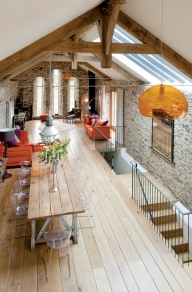
i have a new-found love for restaurant designs. they can be simple, classy, upscale, homey, or ultra-posh. there's so much variety that can happen, and usually they have a very personal atmosphere. i was skimming through pinterest earlier and my attention was instantly caught by this amazing photo of this california restaurant, "the wallace".


the first thing i noticed was those amazing lights. one of my current design obsessions is exposed light bulbs, which is a good thing, because they're a major fad. i'm not sure what i love so much about them except maybe that they are a little eccentric and almost never use fluorescent lights, which is so perfect for me, because i honestly despise those fluorescent bulbs. they create the most UNNATURAL lighting, and i've never been able to find anything i like about them. but enough about my hatred of fluorescence. just look at these beautiful lights. that gorgeous glow they spread in the room, and the eye-catching reflections in the picture frames. 


speaking of picture frames, that brings me to the second attention-grabbing thing about this picture. gallery walls are another personal love of mine, simply because they fit so much creativity and individuality into a small space. you can use anything you want, from family photos to framed butterflies to a prettily-patterned wallpaper scrap or even just an interesting piece of art or graphic design.


another interesting thing about this particular gallery wall is how high the pictures are hung. it gives enough space between the tables along the wall and the ceiling that the room doesn't feel cramped, and even gives the ceilings the appearance of being higher. [which, speaking of ceilings, can i just mention for a second how beautiful those ceiling beams are??] the designer of this restaurant has used large frames and spaced them several inches apart, which also adds to the feel of the restaurant being bigger.


finally, i'll give a quick shout-out to the simplicity of the tables. basic wood and metal chairs, no fuss, no excess. the table settings are clean and simple, and the tables themselves are small. it doesn't get more basic than that.


altogether, the restaurant gives an open, cool appearance while at the same time somehow seeming warm and inviting. if i were walking past the window on a cold day, it would instantly draw me in with its quiet beauty and the idea of a warm meal.

Tuesday, September 10, 2013

sketchup

so, i thought i'd deviate a little from my norm of reposting my favorite pinterest pins and tell you what i'm up to right now!

one of my favorite designers, sarah m. dorsey (i mentioned her in the previous post), recently posted an update on some of her interior design projects. she had them all laid out in 3-d modeling, and i realized that i really need to start playing around with the same programming if i want to do anything in interior design, just to get a feel for what i'd have to do.

so, i found out what design program she used, and lo and behold, there's a simplified version available for free online, which i promptly downloaded.

it's called "sketchup", and looks really, really cool... once i get the hang of it. it's going to take me awhile to learn how to use it. but hopefully, i'll learn quickly, and once i get some designs laid out in it, i'll post the pictures.

i really want to do this mainly to see if this is what i actually want to do in the future. i know already that i'm fascinated by colors and patterns and layouts, but i need to know if i can handle the technical stuff too!

so there's my update. maybe soon i'll post my first sketchup design!

Friday, August 9, 2013

abstract oil painting


it's been a little while since i last posted, but i'm trying to get back in the swing of things!

image via: sarah m. dorsey designs: http://www.sarahmdorseydesigns.blogspot.com/2012/11/abstract-oil-painting.html
my sister introduced me to an amazing design blog a few months ago, and the author, sarah dorsey, has become one of my favorite designers to follow. she has a lot of DIY projects that she and her husband complete together. i would highly recommend checking out her website. she has fantastic ideas for creating beautiful interiors, and even has an etsy site where she sells some of her paint stencils and DIY creations!


sarah m. dorsey is an artist as well as an interior designer, and this is her latest painting. i absolutely adore the colors she used here. there's something about abstract art in particular that always catches my eye. i could stare at colors and designs and patterns and eye catching, mesmerizing mixtures of paint for hours on end.

personally, i think the color combination here is perfect. with the navy, aqua, and turquoise mixed in with touches of green and yellow, it's like catching a glimpse of the sea. but i may be just a little bit biased on the level of perfection here, because these colors have always been among my very favorites.


so there you are! a little more fabulous color to add to this (so far) painfully pale blog.

Thursday, May 2, 2013

simplicity

pinterest link goes to http://www.frolic-blog.com/frolic/2012/04/friday-flowers.html

 "simplicity is the ultimate sophistication"

{leonardo da vinci}

my new motto, in case you were wondering.

laura faith

Saturday, April 20, 2013

repurpose

found on pinterest, redirects to ninbra.tumblr.com
this used to be a barn. A BARN. the design scheme here isn't necessarily my favorite {just look at that orange lamp in the foreground- quite ugly}, but i am just stunned by the fact that this used to be a barn, but was turned into something very liveable and pretty.

i love love love high ceilings, and exposed wood beams always make me happy. i love seeing some rawness in design, and signs of real life. instead of looking like everything was covered up or painted over, the natural beauty shines through.

the stone walls are okayyy, but i honestly think i would have gone with something else. i'm just not sure i like it. maybe it's just this particular style of stone: to me, it just doesn't seem to match well.

the windows at the end of the room are... interesting. i don't think i'll ever truly complain about a window, because, as you've seen through past posts, i just can't get enough natural light. but this brings me around to my actual complaint about the windows: they just aren't big enough!!! they're too narrow. i think i would have just combined the three into one huge window. those french doors on the side are perfect, though. and i adore the skylight.

the wooden floors are perfect, although i might have used a darker stain. it's a little too pale for my taste. i typically like a very pale room with pops of color, but with the darker ceiling beams already there, i think you should go with darker flooring too, and in an even darker stain than the beams. you don't want it all to be the same shade, though, because that's boring. so if there's going to be contrast with the ceiling beams, continue the contrast a little bit more with the flooring.

i must say i DO like those couches, but i think i'd probably scrap everything else and start over. even though i criticized the windows and the flooring a bit, i could definitely live with it, and if i owned this lovely place, i'd probably just leave them and try to work them into a design.

but the main purpose of this post: how i LOVE the idea of re-purposing. i really, really like old houses {or in this case old barns}, and i love to see them turned into something really beautiful. i get a little tired of all the "country-chic/vintage/diy" interior design projects i see around, but i love when you can turn something truly "country-chic" or "vintage" into something clean, bright, modern, and beautiful. {i'm a big fan of modern design. clean lines, people, clean lines!} so i look around for stuff like this. an old barn, given a touch of clean white paint inside, big beautiful windows installed, and turned into a really beautiful home. it's all very "hipster" to re-purpose, but i really enjoy it. i'm not trying to be "in", or go with the crowd, i just really, honestly do enjoy it. recycling is great.

laura faith

Friday, April 12, 2013

brightness

image via jonathan lo: http://www.happymundane.com/
so. been a little while since i last posted, but i thought that today i'd add a little color to this so-far-rather-colorless blog.

i absolutely love yellow and orange. especially together. bright colors make my day. it makes everything seem happier and more positive somehow. they're just so cheerful.

jonathan lo has a very bright, clean, and happy style, and it's one that i'd like to imitate. he's a pretty big inspiration of mine. check out his blog sometime- http://www.happymundane.com/!

laura faith

Friday, March 15, 2013

bedrooms to love


once again this is from pinterest, and it links back to http://emmas.blogg.se/.
i love gray, white and black together. basic, such a simple design, but comfortable.

the pictures above the bed are so well placed. above the symmetry of the bed and lamps, it's absolutely perfect.
the mirror is amazing. i'm a big fan of large, stand alone mirrors leaning against walls. it gives a sense of accidental design, if that makes sense. it's like someone didn't have time to do anything besides prop it up against the wall, but decided to leave it there because it just worked.

THE WINDOW... natural light. need i say more?

walk-in closets are the best. the more space, the better. and, you can actually design a walk-in closet like it's another room.

the lamps are a brilliant way to add in another color to what could be a drab room. the room is trying to stay neutral, but you need a little variation. light wood stains are pretty much an ideal way to do that, and tying the desk area in with the wooden decor helps pull some of the extra color variation farther out into the room.

the chair/desk/tabletop arrangement is perfect. it's simple, but practical, and like i said, it really just pulls the wooden tones further into the room.

last point, the rug. it's almost invisible, but it really just works. it pulls together all the colors so well.
like i said before, simple is my favorite.

laura faith

just a quick one


i just love this.

beautiful.

or i should say,
 beauty full.

Wednesday, March 13, 2013

pinterest post of the day

i want to try and get in the habit of posting about a photo a day from my pinterest design board... and since i have nearly 400 and am constantly adding more every day... that shouldn't be a problem. :)

 this is one of my favorite recent pinterest posts. i took it from the amazing mrs. french's pinterest design board, but this is the original blog this photo links back to: http://www.cococozy.com/

i love this one because it pretty much sums up everything i love about design in one picture, and i'll start off by mentioning the glaringly obvious {literally} favorite point- all that beautiful whiteness. i absolutely adore white rooms. this one might actually be a bit much. maybe i'd use a darker rug, some dark photos on the walls. anything with contrast. it's great for a striking picture in a magazine, i just wouldn't want to live in it every day. i might get snow blindness.

 speaking of contrast, my next two favorite points are the little table and those amazing tulips on top of it. a pop of red and green is exactly what this room needs. personally, i might have actually used more, but i really think the tiny bits of contrast just add to the beauty here.

next, the fantastic french doors and those windows! so much lovely natural light. i love love love natural lighting. i daydream of big windows in small rooms. it brightens them up and makes them look bigger and just more beautiful.

finally, the wall art. i absolutely love the child's drawings on the left wall. it adds a feeling that this actually can be a room to live in, despite the somewhat-overwhelming brightness. it's a hint of a beautiful, simple life, full of happiness and children's laughter.

and simple is my favorite.

laura faith

Sunday, March 10, 2013

by the way

just to let you know... i'm no blog hipster. i'm something of a copycat, actually. i get most of my inspiration from others. so if you come to this blog expecting something new, refreshing, and original... it probably won't be here. i'll be sharing beauty found by others, and maybe little pieces of my own. but it won't be old fashioned. it will be bright, modern, and dazzling. because that's how i love life. when it's so bright you have to squint just to see the forest for the absolutely gorgeous trees, the hidden beauty in the apparent.

"good design is obvious. great design is transparent."
-joe sparano

laura faith
 
image via jonathan lo: http://www.happymundane.com/

opening act


well, here we go! it's me. as of right now, i'm simply a senior in high school, hopefully headed into interior design. this blog is going to be where i get ideas out of my head and hopefully organized in some way, post amazing sites and pictures, and document some of my experiences through college and such, becoming an interior designer. this post is mainly a trial run so that i will have text on my blog so that i can format this thing in a temporary design, which i am bound to hate but hopefully i can personalize more later. anyway. i have great hopes for this blog. like i said before, i want to post pictures, ideas, websites, etc. on this blog, and hopefully fill this corner of the world wide web with beauty and light, my two favorite pieces of design.

laura faith